Branding
3 Beautiful Fall Color Palettes for Your Next Marketing Campaign
3 Beautiful Fall Color Palettes for Your Next Marketing Campaign
3 Beautiful Fall Color Palettes for Your Next Marketing Campaign
As the crisp autumn air arrives, the natural world bursts into a vibrant display of rich colors and warm, earthy tones. In this article, we'll explore three stunning fall-inspired color palettes that can infuse your marketing materials with the spirit of the changing seasons - from websites and email campaigns to branded packaging and social media graphics. Whether you're running a salon, spa, or any other business looking to connect with your audience during this time of year, these palettes are sure to captivate.
The transition from summer to fall is a magical time, as nature's canvas transforms before our eyes. Russet leaves drift lazily to the ground, while the sun casts a golden glow through the trees. It's a season ripe with visual inspiration - and the perfect opportunity to give your marketing a warm, autumnal refresh.
In the following sections, we'll dive into three exceptional color palettes that capture the essence of autumn. From the rich hues of "Harvest Hues" to the cozy tones of "Maple Dream" and the earthy elegance of "Fallen Foliage," these versatile color combinations will help you create marketing materials that truly resonate with your target audience - whether they're browsing your website, opening your emails, or engaging with your brand on social media.
So get ready to embrace the beauty of the season and elevate your fall marketing with these stunning, nature-inspired palettes.
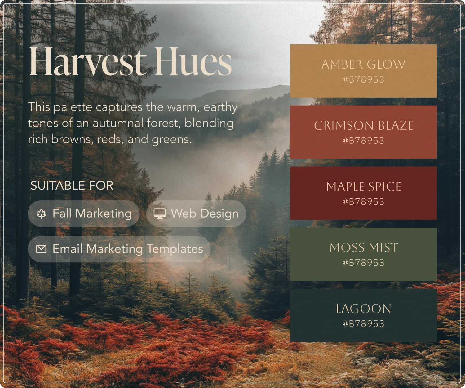
Harvest Hues
Nature's Autumn Canvas.
The palette consists of five complementary colors that perfectly capture the essence of fall:
Amber Glow (#B78953)A warm, golden brown reminiscent of autumn sunlight filtering through trees
Crimson Blaze (#B78953)A rich, rusty red that mirrors fall foliage at its peak
Maple Spice (#B78953)A deeper, more muted burgundy that adds sophistication
Moss Mist (#B78953)A muted sage green that represents evergreen elements
Lagoon (#B78953)A deep forest green that grounds the palette
Why This Palette Works for Marketing:
Versatility: The palette is specifically designed for fall marketing, web design, and email templates
Visual Harmony: It mirrors the natural world, making it instantly relatable and appealing
Emotional Connection: These colors evoke the cozy, warm feelings associated with autumn
Professional Appeal: The balance of warm and cool tones creates a sophisticated look
Practical Applications:
Email Marketing: Use Amber Glow for call-to-action buttons against darker backgrounds
Web Design: Incorporate Crimson Blaze for seasonal accents without overwhelming the design
Brand Materials: The greens (Moss Mist and Lagoon) provide excellent background options while the warmer tones work well for text highlights and graphics
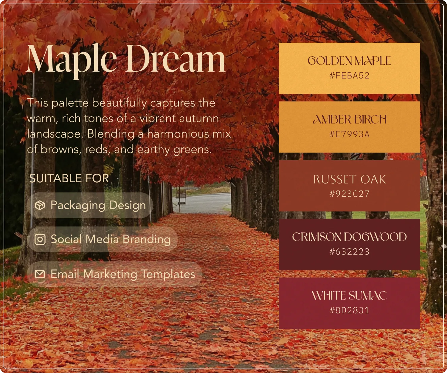
Maple Dream
Capturing the Essence of Autumn
The palette consists of five complementary colors that perfectly capture the essence of fall.
Amber Glow (#B78953)
A warm, golden brown reminiscent of autumn sunlight filtering through trees
Crimson Blaze (#B78953)
A rich, rusty red that mirrors fall foliage at its peakMaple Spice (#B78953)
A deeper, more muted burgundy that adds sophistication
Moss Mist (#B78953)
A muted sage green that represents evergreen elements
Lagoon (#B78953)
A deep forest green that grounds the palette
Why This Palette Works for Marketing:
Versatility: The palette is specifically designed for fall marketing, web design, and email templates
Visual Harmony: It mirrors the natural world, making it instantly relatable and appealing
Emotional Connection: These colors evoke the cozy, warm feelings associated with autumn
Professional Appeal: The balance of warm and cool tones creates a sophisticated look
Practical Applications:
Email Marketing: Use Amber Glow for call-to-action buttons against darker backgrounds
Web Design: Incorporate Crimson Blaze for seasonal accents without overwhelming the design
Brand Materials: The greens (Moss Mist and Lagoon) provide excellent background options while the warmer tones work well for text highlights and graphics
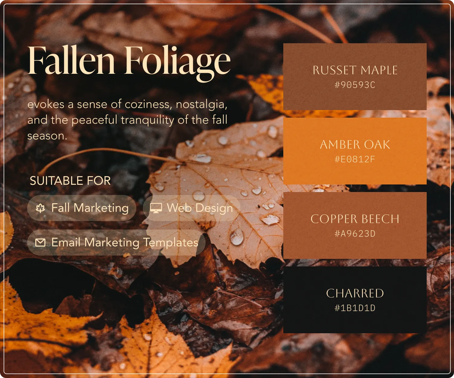
Fallen Foliage
Nature's Autumn Canvas.
The palette consists of four complementary colors that perfectly capture the essence of fall:
Russet Maple (#90593C)
A deep, rusty brown reminiscent of the bark and branches of maple trees
Amber Oak (#E0812F)
A warm, golden-orange hue that mirrors the vibrant leaves of oak trees
Copper Beech (#A9623D)
A rich, coppery brown that evokes the distinctive bark and leaves of the beech tree
Charred (#1B1D1D)
A dark, almost black shade that represents the charred, weathered tones of fallen timber
Why This Palette Works for Marketing:
Authenticity: The palette is directly inspired by the natural colors of an autumnal forest, making it highly relatable and evocative.
Visual Interest: The mix of warm, earthy tones and deeper, richer shades creates a visually compelling and balanced aesthetic.
Emotional Connection: These colors evoke a sense of coziness, nostalgia, and the peaceful tranquility of the fall season.
Versatility: The palette can be used across a wide range of marketing applications, from web design to print collateral.
Practical Applications:
Branding: The muted, organic tones of this palette would work beautifully for autumn-themed brand identities and logos.
Web Design: Incorporate Amber Oak and Copper Beech as accent colors to highlight seasonal content and imagery.
Email Marketing: Use Russet Maple and Charred as the primary background and text colors for a sophisticated, autumnal look.
Packaging: Apply this palette to product packaging, gift boxes, and other fall-focused merchandise for a natural, earthy feel.
Embrace the Beauty of Autumn
As the leaves begin to fall and pumpkin spice lattes make their annual comeback, there's no better time to infuse your marketing with the warm, inviting tones of autumn. By incorporating one of these three beautiful fall color palettes, you can capture the spirit of the changing seasons and forge a deeper, more authentic connection with your customers.
Whether you're designing a cozy, autumnal website for your salon, crafting eye-catching email campaigns for your spa, or creating seasonal social media graphics that stop scrollers in their tracks, these palettes offer a versatile and visually compelling way to celebrate the beauty of fall. So as you plan your next marketing push, let nature be your muse and watch your brand flourish alongside the vibrant hues of the season.
Don’t let a mediocre website hold your salon back. Invest in a professional web design and watch your online presence—and your business—flourish.
The transition from summer to fall is a magical time, as nature's canvas transforms before our eyes. Russet leaves drift lazily to the ground, while the sun casts a golden glow through the trees. It's a season ripe with visual inspiration - and the perfect opportunity to give your marketing a warm, autumnal refresh.
In the following sections, we'll dive into three exceptional color palettes that capture the essence of autumn. From the rich hues of "Harvest Hues" to the cozy tones of "Maple Dream" and the earthy elegance of "Fallen Foliage," these versatile color combinations will help you create marketing materials that truly resonate with your target audience - whether they're browsing your website, opening your emails, or engaging with your brand on social media.
So get ready to embrace the beauty of the season and elevate your fall marketing with these stunning, nature-inspired palettes.

Harvest Hues
Nature's Autumn Canvas.
The palette consists of five complementary colors that perfectly capture the essence of fall:
Amber Glow (#B78953)A warm, golden brown reminiscent of autumn sunlight filtering through trees
Crimson Blaze (#B78953)A rich, rusty red that mirrors fall foliage at its peak
Maple Spice (#B78953)A deeper, more muted burgundy that adds sophistication
Moss Mist (#B78953)A muted sage green that represents evergreen elements
Lagoon (#B78953)A deep forest green that grounds the palette
Why This Palette Works for Marketing:
Versatility: The palette is specifically designed for fall marketing, web design, and email templates
Visual Harmony: It mirrors the natural world, making it instantly relatable and appealing
Emotional Connection: These colors evoke the cozy, warm feelings associated with autumn
Professional Appeal: The balance of warm and cool tones creates a sophisticated look
Practical Applications:
Email Marketing: Use Amber Glow for call-to-action buttons against darker backgrounds
Web Design: Incorporate Crimson Blaze for seasonal accents without overwhelming the design
Brand Materials: The greens (Moss Mist and Lagoon) provide excellent background options while the warmer tones work well for text highlights and graphics

Maple Dream
Capturing the Essence of Autumn
The palette consists of five complementary colors that perfectly capture the essence of fall.
Amber Glow (#B78953)
A warm, golden brown reminiscent of autumn sunlight filtering through trees
Crimson Blaze (#B78953)
A rich, rusty red that mirrors fall foliage at its peakMaple Spice (#B78953)
A deeper, more muted burgundy that adds sophistication
Moss Mist (#B78953)
A muted sage green that represents evergreen elements
Lagoon (#B78953)
A deep forest green that grounds the palette
Why This Palette Works for Marketing:
Versatility: The palette is specifically designed for fall marketing, web design, and email templates
Visual Harmony: It mirrors the natural world, making it instantly relatable and appealing
Emotional Connection: These colors evoke the cozy, warm feelings associated with autumn
Professional Appeal: The balance of warm and cool tones creates a sophisticated look
Practical Applications:
Email Marketing: Use Amber Glow for call-to-action buttons against darker backgrounds
Web Design: Incorporate Crimson Blaze for seasonal accents without overwhelming the design
Brand Materials: The greens (Moss Mist and Lagoon) provide excellent background options while the warmer tones work well for text highlights and graphics

Fallen Foliage
Nature's Autumn Canvas.
The palette consists of four complementary colors that perfectly capture the essence of fall:
Russet Maple (#90593C)
A deep, rusty brown reminiscent of the bark and branches of maple trees
Amber Oak (#E0812F)
A warm, golden-orange hue that mirrors the vibrant leaves of oak trees
Copper Beech (#A9623D)
A rich, coppery brown that evokes the distinctive bark and leaves of the beech tree
Charred (#1B1D1D)
A dark, almost black shade that represents the charred, weathered tones of fallen timber
Why This Palette Works for Marketing:
Authenticity: The palette is directly inspired by the natural colors of an autumnal forest, making it highly relatable and evocative.
Visual Interest: The mix of warm, earthy tones and deeper, richer shades creates a visually compelling and balanced aesthetic.
Emotional Connection: These colors evoke a sense of coziness, nostalgia, and the peaceful tranquility of the fall season.
Versatility: The palette can be used across a wide range of marketing applications, from web design to print collateral.
Practical Applications:
Branding: The muted, organic tones of this palette would work beautifully for autumn-themed brand identities and logos.
Web Design: Incorporate Amber Oak and Copper Beech as accent colors to highlight seasonal content and imagery.
Email Marketing: Use Russet Maple and Charred as the primary background and text colors for a sophisticated, autumnal look.
Packaging: Apply this palette to product packaging, gift boxes, and other fall-focused merchandise for a natural, earthy feel.
Embrace the Beauty of Autumn
As the leaves begin to fall and pumpkin spice lattes make their annual comeback, there's no better time to infuse your marketing with the warm, inviting tones of autumn. By incorporating one of these three beautiful fall color palettes, you can capture the spirit of the changing seasons and forge a deeper, more authentic connection with your customers.
Whether you're designing a cozy, autumnal website for your salon, crafting eye-catching email campaigns for your spa, or creating seasonal social media graphics that stop scrollers in their tracks, these palettes offer a versatile and visually compelling way to celebrate the beauty of fall. So as you plan your next marketing push, let nature be your muse and watch your brand flourish alongside the vibrant hues of the season.
Don’t let a mediocre website hold your salon back. Invest in a professional web design and watch your online presence—and your business—flourish.
The transition from summer to fall is a magical time, as nature's canvas transforms before our eyes. Russet leaves drift lazily to the ground, while the sun casts a golden glow through the trees. It's a season ripe with visual inspiration - and the perfect opportunity to give your marketing a warm, autumnal refresh.
In the following sections, we'll dive into three exceptional color palettes that capture the essence of autumn. From the rich hues of "Harvest Hues" to the cozy tones of "Maple Dream" and the earthy elegance of "Fallen Foliage," these versatile color combinations will help you create marketing materials that truly resonate with your target audience - whether they're browsing your website, opening your emails, or engaging with your brand on social media.
So get ready to embrace the beauty of the season and elevate your fall marketing with these stunning, nature-inspired palettes.

Harvest Hues
Nature's Autumn Canvas.
The palette consists of five complementary colors that perfectly capture the essence of fall:
Amber Glow (#B78953)A warm, golden brown reminiscent of autumn sunlight filtering through trees
Crimson Blaze (#B78953)A rich, rusty red that mirrors fall foliage at its peak
Maple Spice (#B78953)A deeper, more muted burgundy that adds sophistication
Moss Mist (#B78953)A muted sage green that represents evergreen elements
Lagoon (#B78953)A deep forest green that grounds the palette
Why This Palette Works for Marketing:
Versatility: The palette is specifically designed for fall marketing, web design, and email templates
Visual Harmony: It mirrors the natural world, making it instantly relatable and appealing
Emotional Connection: These colors evoke the cozy, warm feelings associated with autumn
Professional Appeal: The balance of warm and cool tones creates a sophisticated look
Practical Applications:
Email Marketing: Use Amber Glow for call-to-action buttons against darker backgrounds
Web Design: Incorporate Crimson Blaze for seasonal accents without overwhelming the design
Brand Materials: The greens (Moss Mist and Lagoon) provide excellent background options while the warmer tones work well for text highlights and graphics

Maple Dream
Capturing the Essence of Autumn
The palette consists of five complementary colors that perfectly capture the essence of fall.
Amber Glow (#B78953)
A warm, golden brown reminiscent of autumn sunlight filtering through trees
Crimson Blaze (#B78953)
A rich, rusty red that mirrors fall foliage at its peakMaple Spice (#B78953)
A deeper, more muted burgundy that adds sophistication
Moss Mist (#B78953)
A muted sage green that represents evergreen elements
Lagoon (#B78953)
A deep forest green that grounds the palette
Why This Palette Works for Marketing:
Versatility: The palette is specifically designed for fall marketing, web design, and email templates
Visual Harmony: It mirrors the natural world, making it instantly relatable and appealing
Emotional Connection: These colors evoke the cozy, warm feelings associated with autumn
Professional Appeal: The balance of warm and cool tones creates a sophisticated look
Practical Applications:
Email Marketing: Use Amber Glow for call-to-action buttons against darker backgrounds
Web Design: Incorporate Crimson Blaze for seasonal accents without overwhelming the design
Brand Materials: The greens (Moss Mist and Lagoon) provide excellent background options while the warmer tones work well for text highlights and graphics

Fallen Foliage
Nature's Autumn Canvas.
The palette consists of four complementary colors that perfectly capture the essence of fall:
Russet Maple (#90593C)
A deep, rusty brown reminiscent of the bark and branches of maple trees
Amber Oak (#E0812F)
A warm, golden-orange hue that mirrors the vibrant leaves of oak trees
Copper Beech (#A9623D)
A rich, coppery brown that evokes the distinctive bark and leaves of the beech tree
Charred (#1B1D1D)
A dark, almost black shade that represents the charred, weathered tones of fallen timber
Why This Palette Works for Marketing:
Authenticity: The palette is directly inspired by the natural colors of an autumnal forest, making it highly relatable and evocative.
Visual Interest: The mix of warm, earthy tones and deeper, richer shades creates a visually compelling and balanced aesthetic.
Emotional Connection: These colors evoke a sense of coziness, nostalgia, and the peaceful tranquility of the fall season.
Versatility: The palette can be used across a wide range of marketing applications, from web design to print collateral.
Practical Applications:
Branding: The muted, organic tones of this palette would work beautifully for autumn-themed brand identities and logos.
Web Design: Incorporate Amber Oak and Copper Beech as accent colors to highlight seasonal content and imagery.
Email Marketing: Use Russet Maple and Charred as the primary background and text colors for a sophisticated, autumnal look.
Packaging: Apply this palette to product packaging, gift boxes, and other fall-focused merchandise for a natural, earthy feel.
Embrace the Beauty of Autumn
As the leaves begin to fall and pumpkin spice lattes make their annual comeback, there's no better time to infuse your marketing with the warm, inviting tones of autumn. By incorporating one of these three beautiful fall color palettes, you can capture the spirit of the changing seasons and forge a deeper, more authentic connection with your customers.
Whether you're designing a cozy, autumnal website for your salon, crafting eye-catching email campaigns for your spa, or creating seasonal social media graphics that stop scrollers in their tracks, these palettes offer a versatile and visually compelling way to celebrate the beauty of fall. So as you plan your next marketing push, let nature be your muse and watch your brand flourish alongside the vibrant hues of the season.
Don’t let a mediocre website hold your salon back. Invest in a professional web design and watch your online presence—and your business—flourish.

Published: Oct 12, 2024
Author: Caite Brooks
Share this article:
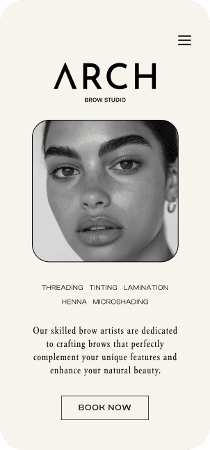
Gorgeous websites that grow your beauty business.
With over 20 years of experience in the beauty industry, we understand the dedication and passion behind every thriving salon or spa. We recognize that a powerful online presence is essential in today's competitive market, and we're here to help you achieve it.
Our mission is to empower beauty businesses like yours to attract more clients, streamline operations, and achieve sustainable growth through exceptional web design.

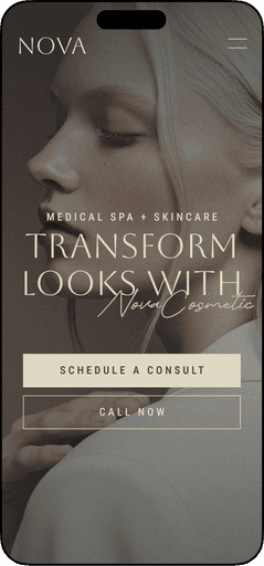
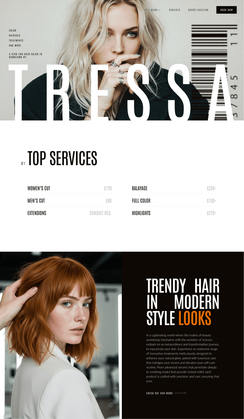
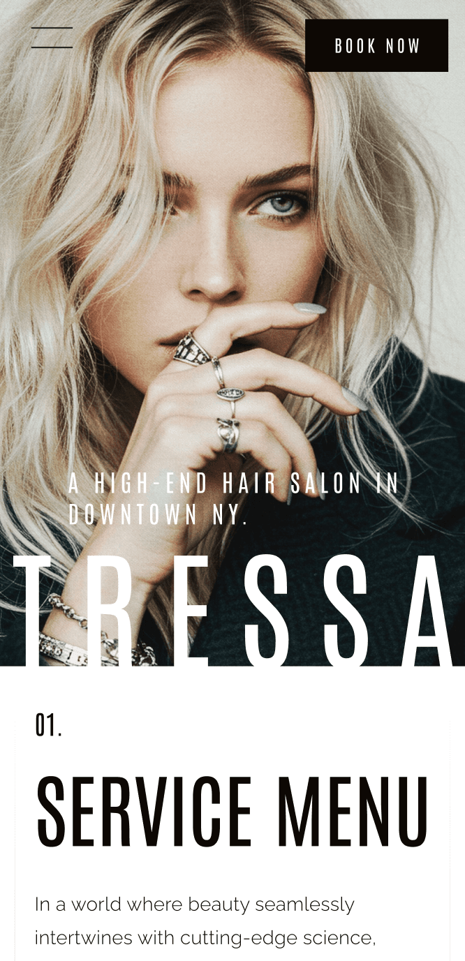
READY-MADE PREMIUM TEMPLATES
READY-MADE PREMIUM TEMPLATES
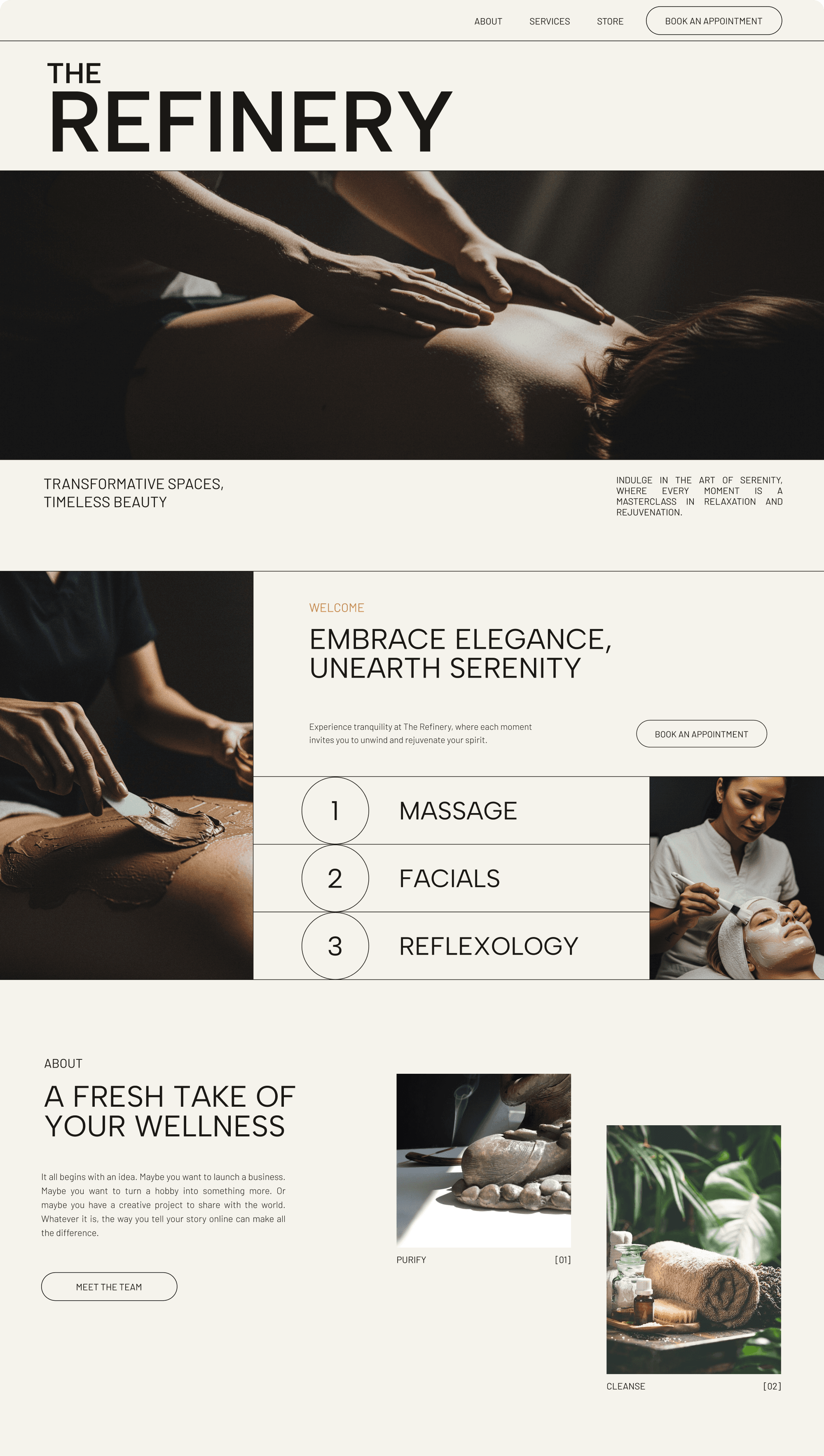
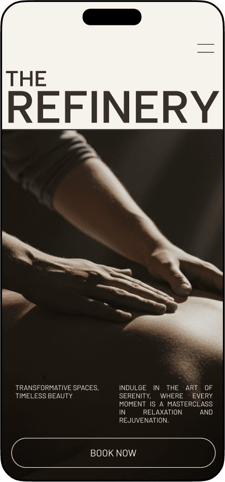
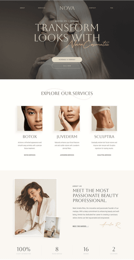
Beautiful Designs Ready for your Personal Touch
Whether you want a quick, professional setup or a little extra polish to make it feel like you — we’ve got two customization packages tailored for beauty brands.







Ready for
your glowup?
Start by telling us about your vision. Our quick questionnaire helps us understand your needs and create the perfect website for your beauty business.


Ready for
your glowup?
Start by telling us about your vision. Our quick questionnaire helps us understand your needs and create the perfect website for your beauty business.


Ready for
your glowup?
Start by telling us about your vision. Our quick questionnaire helps us understand your needs and create the perfect website for your beauty business.


Designing online success for salons, spas, & more.
contact@glowuponline.com

Designing online success for salons, spas, & more.
contact@glowuponline.com

Designing online success for salons, spas, & more.
contact@glowuponline.com