Branding
Elevate Your Designs with These Pantone Color Choices
Elevate Your Designs with These Pantone Color Choices
Elevate Your Designs with These Pantone Color Choices
For designers seeking precision, the Pantone system is an invaluable resource, offering a standardized approach to color selection. Its consistency makes it a go-to choice for projects of all sizes.
Mocha Mousse

This rich and warm palette, inspired by the comforting shades of coffee, is built using Pantone colors. ICED CAPPUCCINO (#F2D9CE), a light, creamy beige, provides a gentle base. The titular MOCHA MOUSSE (#A57865), also the Pantone® Color of the Year 2025, offers a soothing mid-tone brown that adds depth. MILK CHOCOLATE (#683924) brings a classic, cozy brown, while ESPRESSO (#260F06) anchors the palette with a dark and grounding hue.
These shades work well together for designs that seek to evoke feelings of comfort, sophistication, or indulgence. Perfect for branding, websites, or packaging that require a warm and inviting look, particularly cafes, bakeries or other food products. The soft Iced Cappuccino could work as a background, with Mocha Mousse or Milk Chocolate as main text, and Espresso to add a dramatic contrast. Using these Pantone selections together will create a cohesive and professional visual identity.
Coconut Milk

This neutral yet sophisticated palette, composed of subtle Pantone colors, is inspired by the clean, natural tones of coconut milk. The light COCONUT MILK (#EBE9DD) creates a gentle base with subtle warmth. SAGE (#A8A696) introduces a touch of nature with a soft, muted green-grey that is both calming and sophisticated. WARM BEIGE (#D4C7AF) adds depth with a creamy and inviting tone. The grounded feel of TAUPE BROWN (#766B5D) provides a dark neutral shade to balance the palette.
This selection of Pantone colors is perfect for designs seeking a minimal, elegant or organic feel. It's a versatile palette for branding, websites, or product design that require a clean, earthy or refined appearance. Coconut Milk could be used as a primary background with Sage and Warm Beige for the text and secondary elements, while Taupe Brown could emphasize key interactive elements. This combination creates a sophisticated feel that is cohesive and professional.

Pesto
This fresh and organic palette, curated with specific Pantone colors, draws inspiration from vibrant shades of green. PESTO (#5C5F32) provides a rich, earthy green. SPRING LEAF (#94A65D) adds a lighter, more vibrant green, reminiscent of new growth. CELERY (#D5E79E) is a gentle, pale green that acts as a refreshing highlight, while the darker FOREST PINE (#3E4021) gives a grounding, natural feel.
These Pantone choices provide a range of greens that can be used in branding, product design, and websites. It's an ideal palette for nature-inspired designs, sustainable brands, or projects aiming for a feeling of freshness and vitality. The light Celery can be used as a background, with Spring Leaf or Pesto as the primary text colors, and Forest Pine for secondary text, links or buttons. This strategic use of Pantone colors will create a cohesive and professional feel for your design.
Experiment with these inspiring Pantone color palettes to elevate your designs and bring your vision to life or explore our templates for your next project!
Mocha Mousse
This rich and warm palette, inspired by the comforting shades of coffee, is built using Pantone colors. ICED CAPPUCCINO (#F2D9CE), a light, creamy beige, provides a gentle base. The titular MOCHA MOUSSE (#A57865), also the Pantone® Color of the Year 2025, offers a soothing mid-tone brown that adds depth. MILK CHOCOLATE (#683924) brings a classic, cozy brown, while ESPRESSO (#260F06) anchors the palette with a dark and grounding hue.
These shades work well together for designs that seek to evoke feelings of comfort, sophistication, or indulgence. Perfect for branding, websites, or packaging that require a warm and inviting look, particularly cafes, bakeries or other food products. The soft Iced Cappuccino could work as a background, with Mocha Mousse or Milk Chocolate as main text, and Espresso to add a dramatic contrast. Using these Pantone selections together will create a cohesive and professional visual identity.
Coconut Milk
This neutral yet sophisticated palette, composed of subtle Pantone colors, is inspired by the clean, natural tones of coconut milk. The light COCONUT MILK (#EBE9DD) creates a gentle base with subtle warmth. SAGE (#A8A696) introduces a touch of nature with a soft, muted green-grey that is both calming and sophisticated. WARM BEIGE (#D4C7AF) adds depth with a creamy and inviting tone. The grounded feel of TAUPE BROWN (#766B5D) provides a dark neutral shade to balance the palette.
This selection of Pantone colors is perfect for designs seeking a minimal, elegant or organic feel. It's a versatile palette for branding, websites, or product design that require a clean, earthy or refined appearance. Coconut Milk could be used as a primary background with Sage and Warm Beige for the text and secondary elements, while Taupe Brown could emphasize key interactive elements. This combination creates a sophisticated feel that is cohesive and professional.
Pesto
This fresh and organic palette, curated with specific Pantone colors, draws inspiration from vibrant shades of green. PESTO (#5C5F32) provides a rich, earthy green. SPRING LEAF (#94A65D) adds a lighter, more vibrant green, reminiscent of new growth. CELERY (#D5E79E) is a gentle, pale green that acts as a refreshing highlight, while the darker FOREST PINE (#3E4021) gives a grounding, natural feel.
These Pantone choices provide a range of greens that can be used in branding, product design, and websites. It's an ideal palette for nature-inspired designs, sustainable brands, or projects aiming for a feeling of freshness and vitality. The light Celery can be used as a background, with Spring Leaf or Pesto as the primary text colors, and Forest Pine for secondary text, links or buttons. This strategic use of Pantone colors will create a cohesive and professional feel for your design.
Experiment with these inspiring Pantone color palettes to elevate your designs and bring your vision to life or explore our templates for your next project!

Published: Dec 30, 2024
Author: Caite Brooks
Share this article:


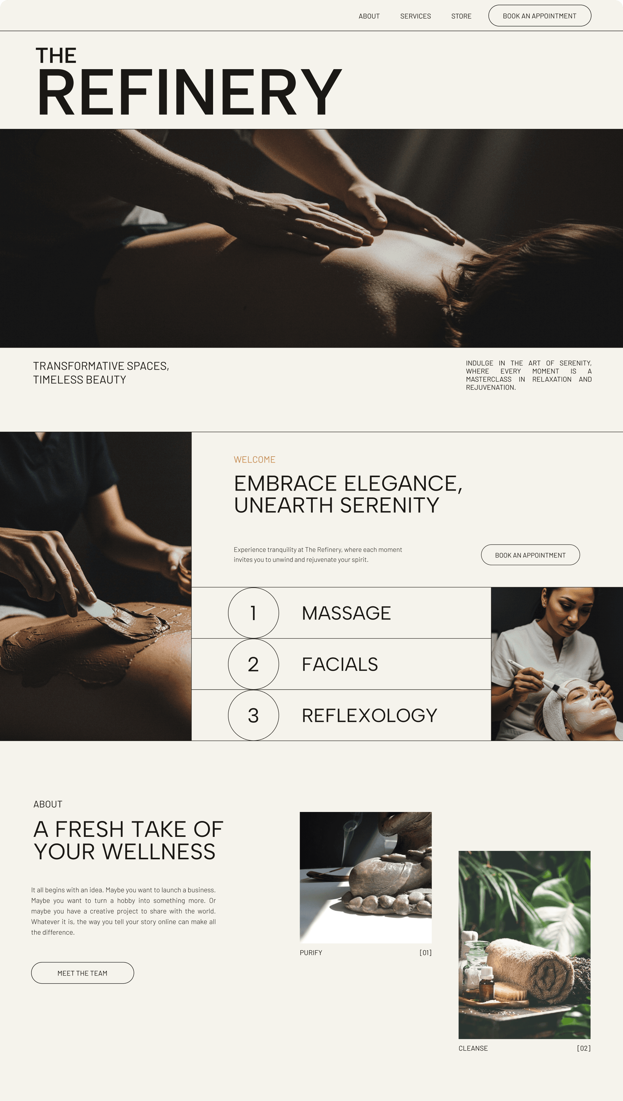
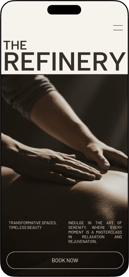
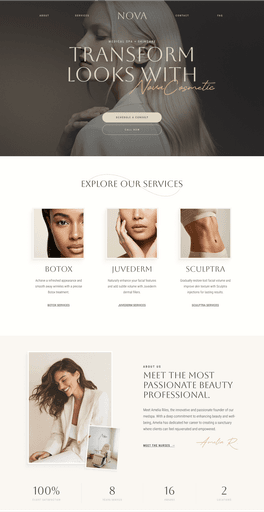
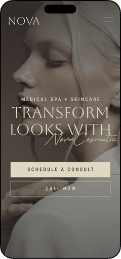
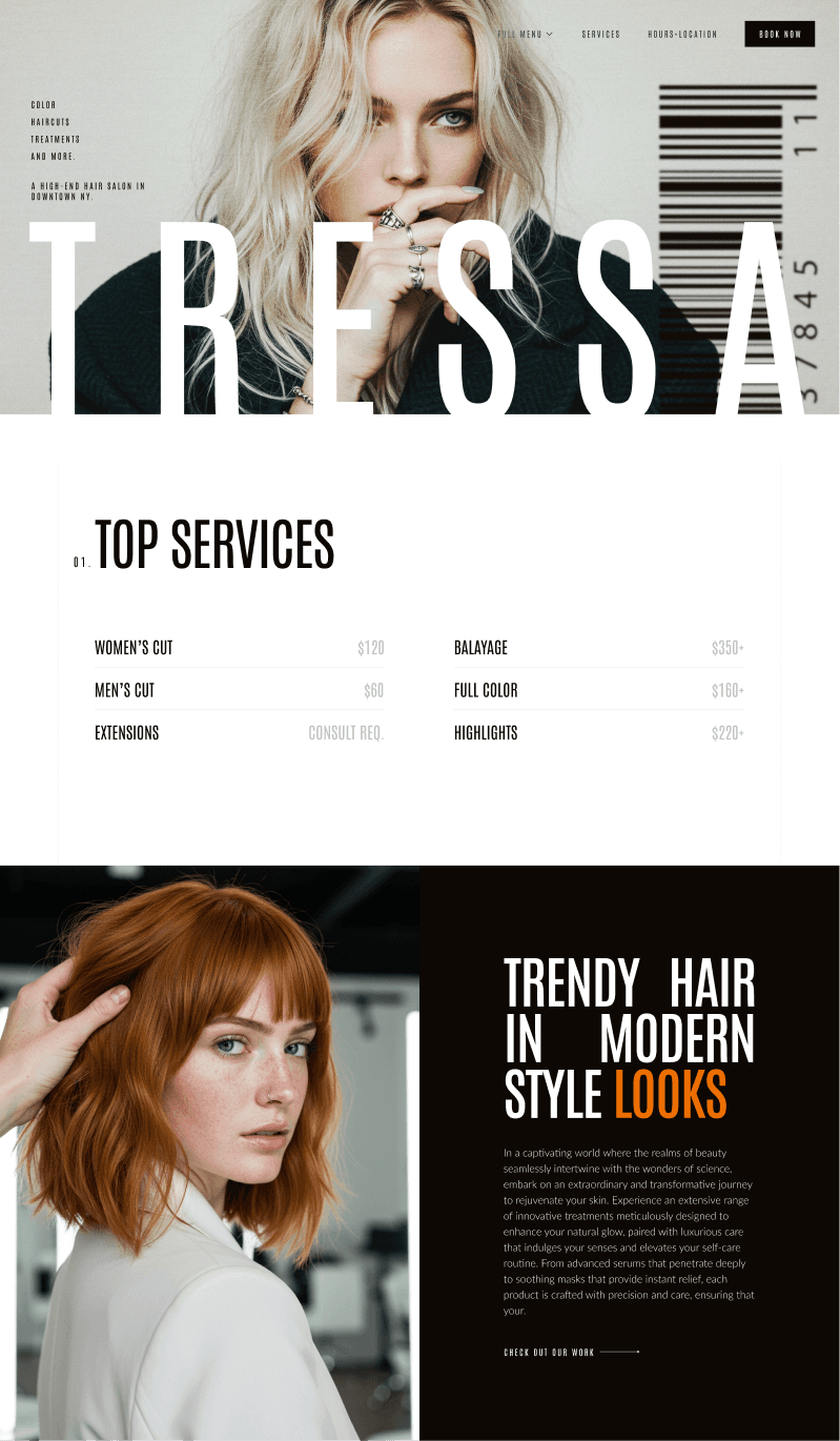
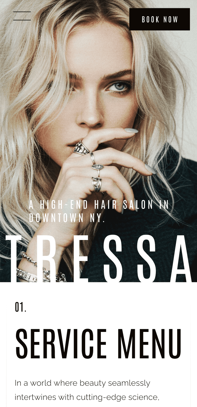
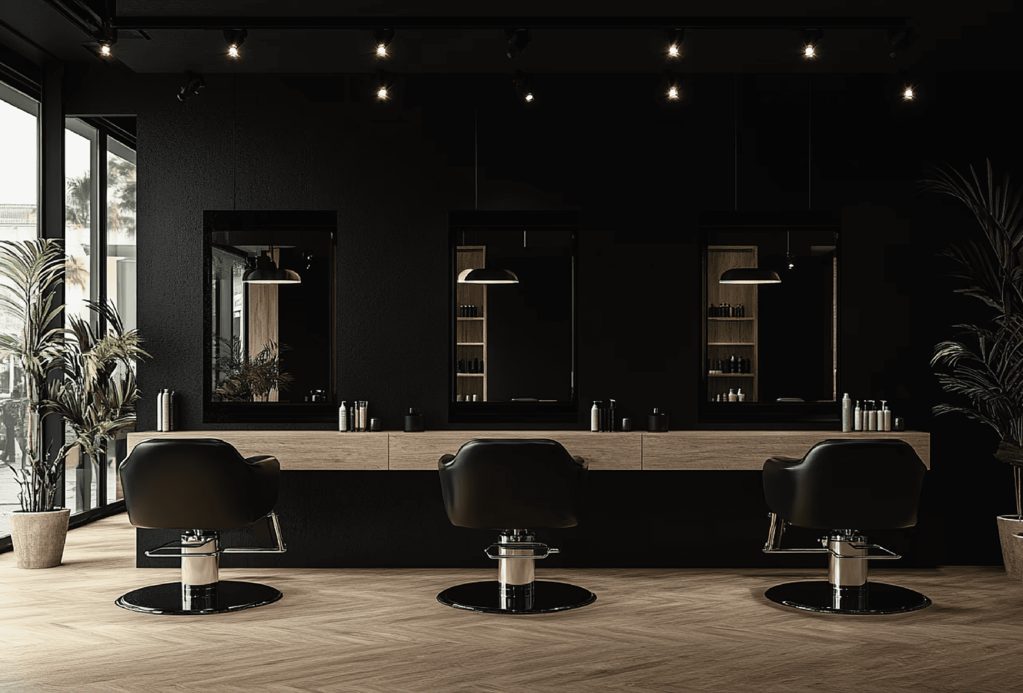
Gorgeous websites that grow your beauty business.
With over 20 years of experience in the beauty industry, we understand the dedication and passion behind every thriving salon or spa. We recognize that a powerful online presence is essential in today's competitive market, and we're here to help you achieve it.
Our mission is to empower beauty businesses like yours to attract more clients, streamline operations, and achieve sustainable growth through exceptional web design.

READY-MADE PREMIUM TEMPLATES
READY-MADE PREMIUM TEMPLATES
Beautiful Designs Ready for your Personal Touch
Whether you want a quick, professional setup or a little extra polish to make it feel like you — we’ve got two customization packages tailored for beauty brands.


Ready for
your glowup?
Start by telling us about your vision. Our quick questionnaire helps us understand your needs and create the perfect website for your beauty business.

Ready for
your glowup?
Start by telling us about your vision. Our quick questionnaire helps us understand your needs and create the perfect website for your beauty business.
Ready for
your glowup?
Start by telling us about your vision. Our quick questionnaire helps us understand your needs and create the perfect website for your beauty business.

Designing online success for salons, spas, & more.
contact@glowuponline.com
Designing online success for salons, spas, & more.
contact@glowuponline.com
Designing online success for salons, spas, & more.
contact@glowuponline.com